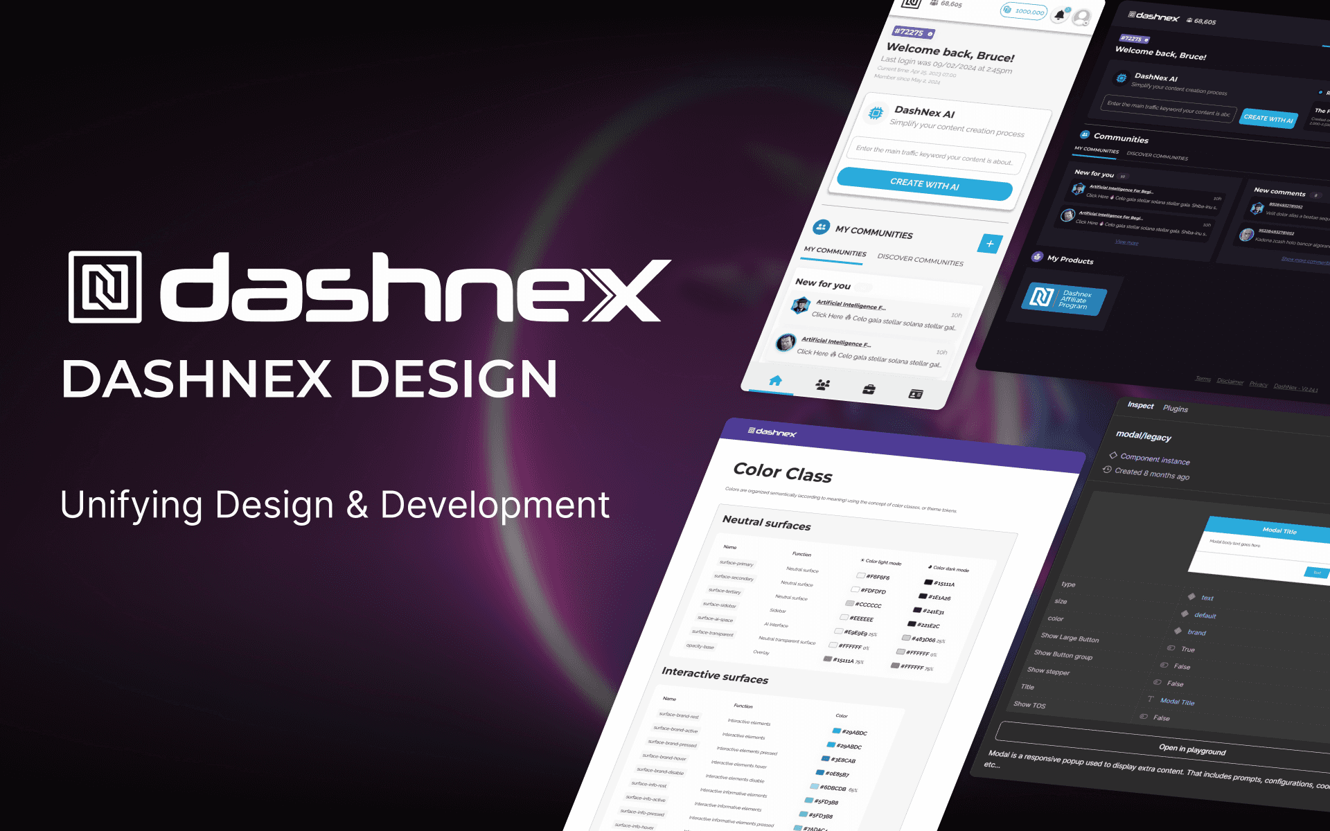
Dashnex Design System
Dashnex Design System
This project aimed to create a scalable and consistent design system that would unify Dashnex’s fragmented UI, improve collaboration, and ensure a seamless user experience.
This project aimed to create a scalable and consistent design system that would unify Dashnex’s fragmented UI, improve collaboration, and ensure a seamless user experience.
Dashnex
60 hours
July 2024
Role: UX Lead
CONTEXT
CONTEXT
Why Did We Create a Design System?
Why Did We Create a Design System?
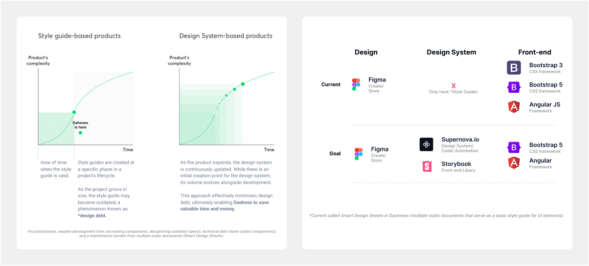
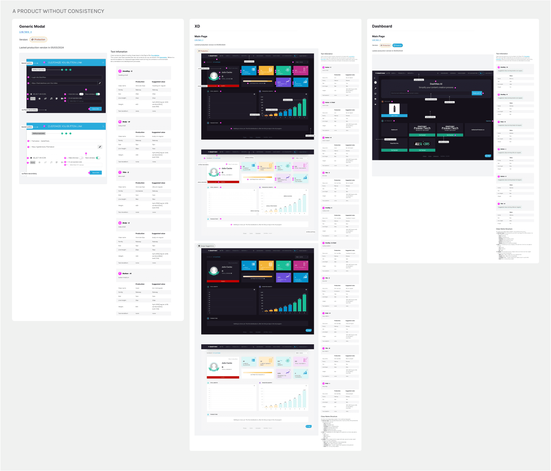
Dashnex faced a fragmented UI with outdated components, multiple Bootstrap versions, and unclear ownership of design styles. A unified design system was required to address these inefficiencies and enable scalability.
Dashnex faced a fragmented UI with outdated components, multiple Bootstrap versions, and unclear ownership of design styles. A unified design system was required to address these inefficiencies and enable scalability.
Inconsistencies: UI components behaved differently depending on the framework used.
Inconsistencies: UI components behaved differently depending on the framework used.
Inconsistencies: UI components behaved differently depending on the framework used.
High Maintenance: Supporting legacy frameworks (Bootstrap 3 and AngularJS) added technical debt.
High Maintenance: Supporting legacy frameworks (Bootstrap 3 and AngularJS) added technical debt.
High Maintenance: Supporting legacy frameworks (Bootstrap 3 and AngularJS) added technical debt.
Scalability Issues: Adding new features often required duplicating efforts across frameworks.
Scalability Issues: Adding new features often required duplicating efforts across frameworks.
Scalability Issues: Adding new features often required duplicating efforts across frameworks.
Key Objectives
Unification
Unification
Unification
Consistency
Consistency
Consistency
Efficiency
Efficiency
Efficiency
Scalability
Scalability
Scalability
Project Timeline
Project Timeline
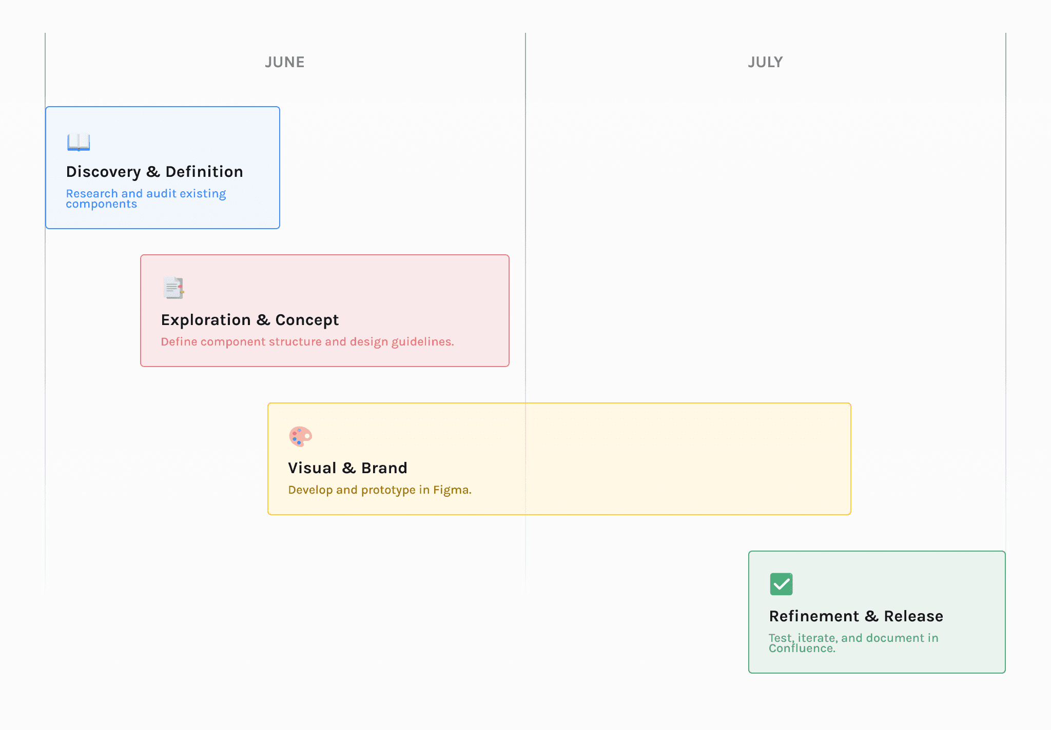
DISCOVERY
Challenges Identified
Conducted a frontend audit to map component inconsistencies and framework dependencies.
Conducted a frontend audit to map component inconsistencies and framework dependencies.
RESEARCH
RESEARCH
Defining Needs Through Research
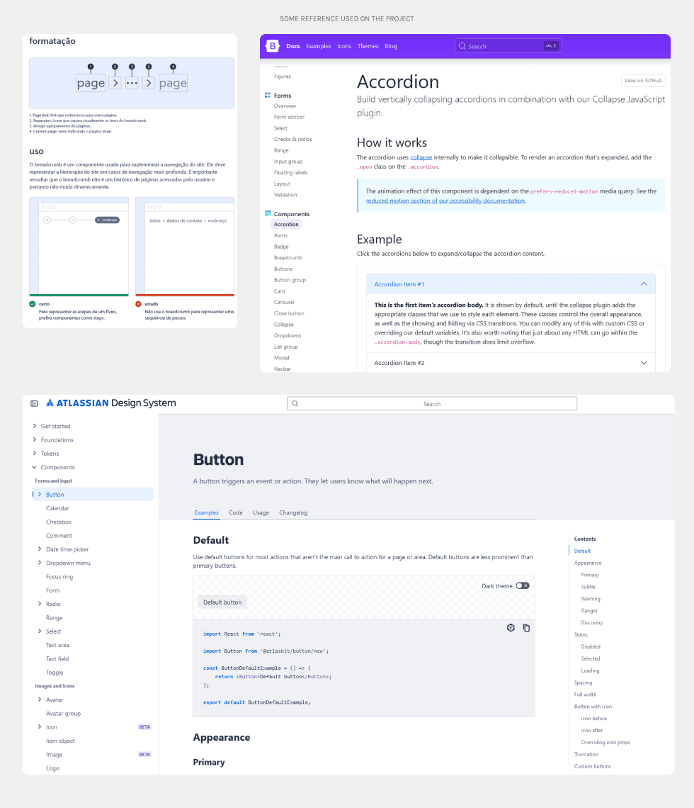
We analyzed design systems from Bootstrap, Olist, and Atlassian to understand their scalability and modularity. These references provided best practices for component creation and documentation.
We analyzed design systems from Bootstrap, Olist, and Atlassian to understand their scalability and modularity. These references provided best practices for component creation and documentation.
DEFINE & IDEATION
DEFINE & IDEATION
Process
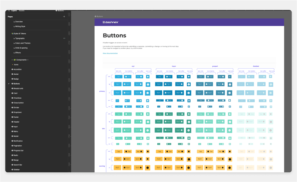
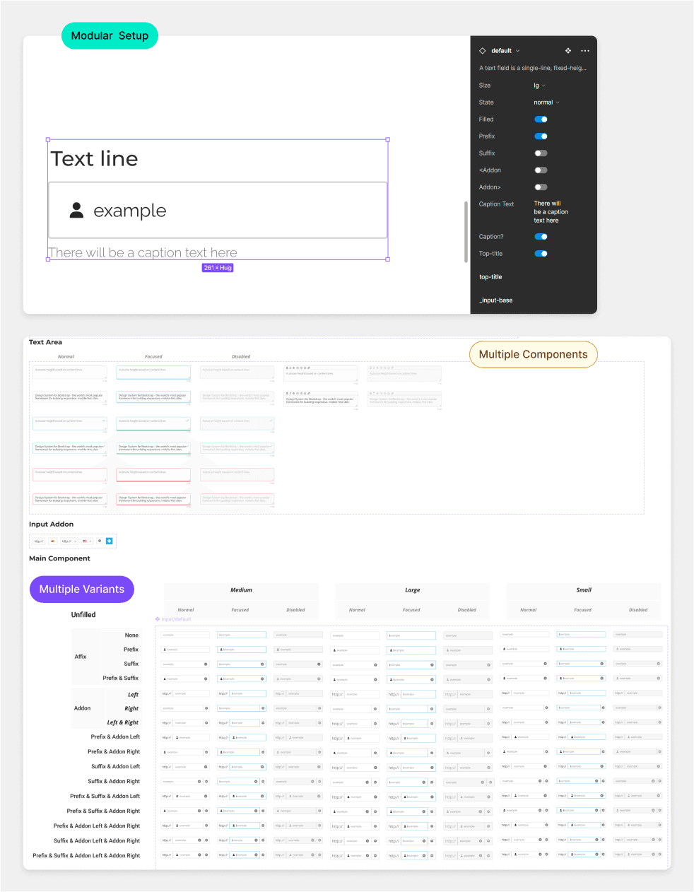
Centralized UI components using Atomic Design principles.
Centralized UI components using Atomic Design principles.
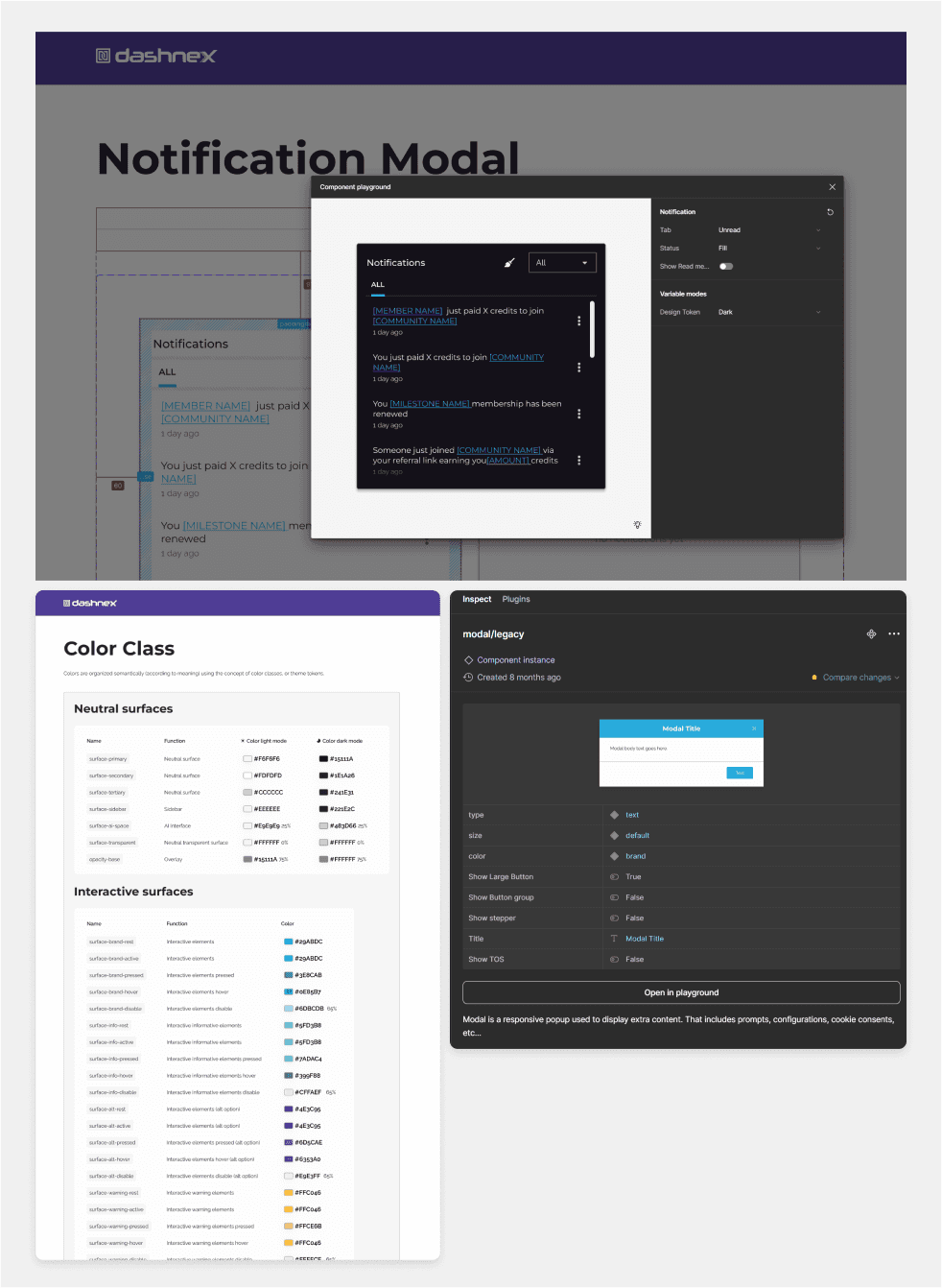
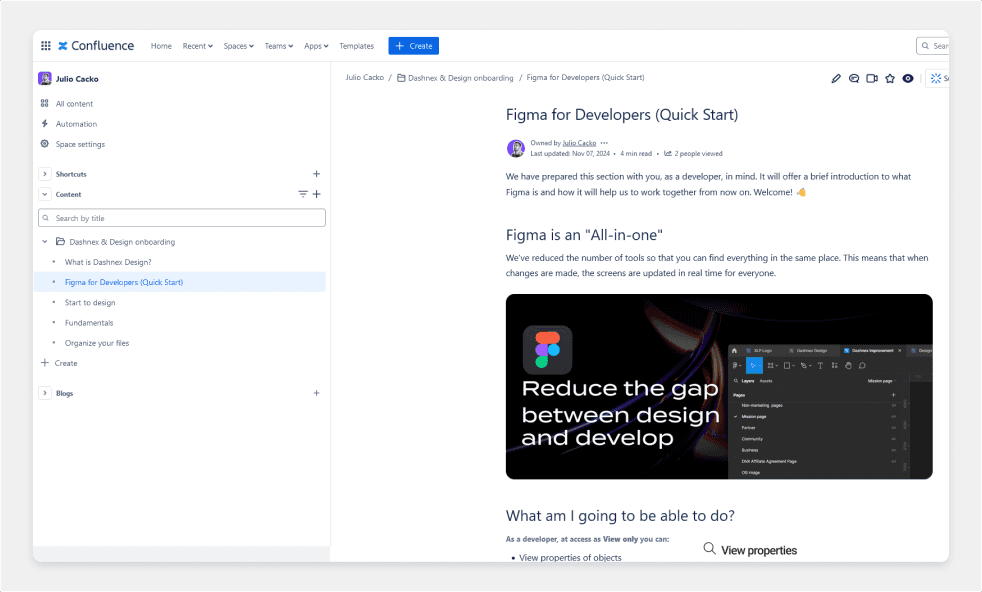
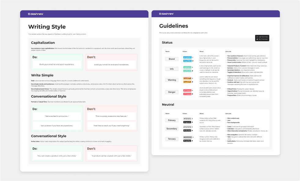
Guidelines for developers and designers on Confluence include specific templates and processes to ensure consistency in every new project. There are also additional guidelines in the Figma document.
Guidelines for developers and designers on Confluence include specific templates and processes to ensure consistency in every new project. There are also additional guidelines in the Figma document.
Collaborated with developers to include tokens and CSS snippets in Figma.
Collaborated with developers to include tokens and CSS snippets in Figma.
Prototype
Prototype
Making it easy to understand while allowing for growth.
The system will grow and be used by many people. To make sure everything works well as it expands, I focused on using basic design ideas, creating components that fit together, and using simple options for different variations.
The system will grow and be used by many people. To make sure everything works well as it expands, I focused on using basic design ideas, creating components that fit together, and using simple options for different variations.
LOOKING BACK
LOOKING BACK
Retrospective
🙌 Wins
🙌 Wins
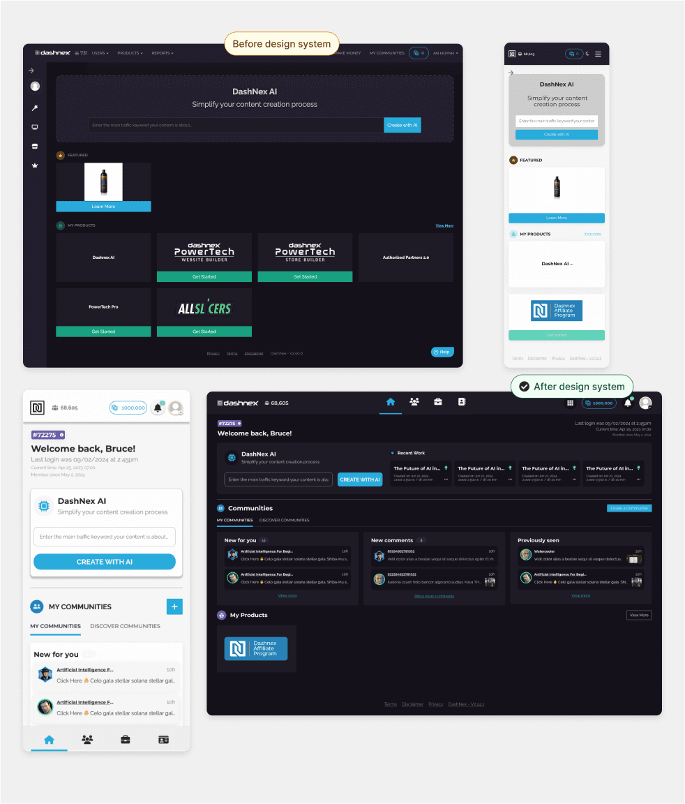
Faster implementation and reduced coding time.
Consistent QA outputs with fewer design discrepancies.
Reduced UI discrepancies caused by mixed frameworks.
Faster implementation and reduced coding time.
Consistent QA outputs with fewer design discrepancies.
Reduced UI discrepancies caused by mixed frameworks.
Faster implementation and reduced coding time.
Consistent QA outputs with fewer design discrepancies.
Reduced UI discrepancies caused by mixed frameworks.
What We Achieved
What We Achieved
What We Achieved
Unified Frameworks: Fully standardized the frontend on Bootstrap 5 and Angular Framework.
Unified Frameworks: Fully standardized the frontend on Bootstrap 5 and Angular Framework.
Unified Frameworks: Fully standardized the frontend on Bootstrap 5 and Angular Framework.
Reusable Components: Designed a library that supports scalability and future growth.
Reusable Components: Designed a library that supports scalability and future growth.
Reusable Components: Designed a library that supports scalability and future growth.
Reduced Technical Debt: Phased out reliance on AngularJS and Bootstrap 3.
Reduced Technical Debt: Phased out reliance on AngularJS and Bootstrap 3.
Reduced Technical Debt: Phased out reliance on AngularJS and Bootstrap 3.
Lessons Learned
Lessons Learned
Lessons Learned
Early collaboration between designers and developers simplifies migrations.
Comprehensive documentation is critical during framework transitions.
Iterative feedback improves component reliability across frameworks
Early collaboration between designers and developers simplifies migrations.
Comprehensive documentation is critical during framework transitions.
Iterative feedback improves component reliability across frameworks
Early collaboration between designers and developers simplifies migrations.
Comprehensive documentation is critical during framework transitions.
Iterative feedback improves component reliability across frameworks
NEXT STEPS
NEXT STEPS
Opportunities for Improvement
Expand Component Library: Add complex UI elements like modals and tables for Bootstrap 5 and Angular.
Expand Component Library: Add complex UI elements like modals and tables for Bootstrap 5 and Angular.
Expand Component Library: Add complex UI elements like modals and tables for Bootstrap 5 and Angular.
Legacy Sunset Plan: Decommission AngularJS and Bootstrap 3 completely.
Legacy Sunset Plan: Decommission AngularJS and Bootstrap 3 completely.
Legacy Sunset Plan: Decommission AngularJS and Bootstrap 3 completely.
Feedback Mechanism: Regular team surveys to evaluate migration success and identify improvement areas.
Feedback Mechanism: Regular team surveys to evaluate migration success and identify improvement areas.
Feedback Mechanism: Regular team surveys to evaluate migration success and identify improvement areas.
Try It Yourself!
Try It Yourself!
Explore the Dashnex Design System prototype on Figma .