Dcide Design System
Dcide Design System
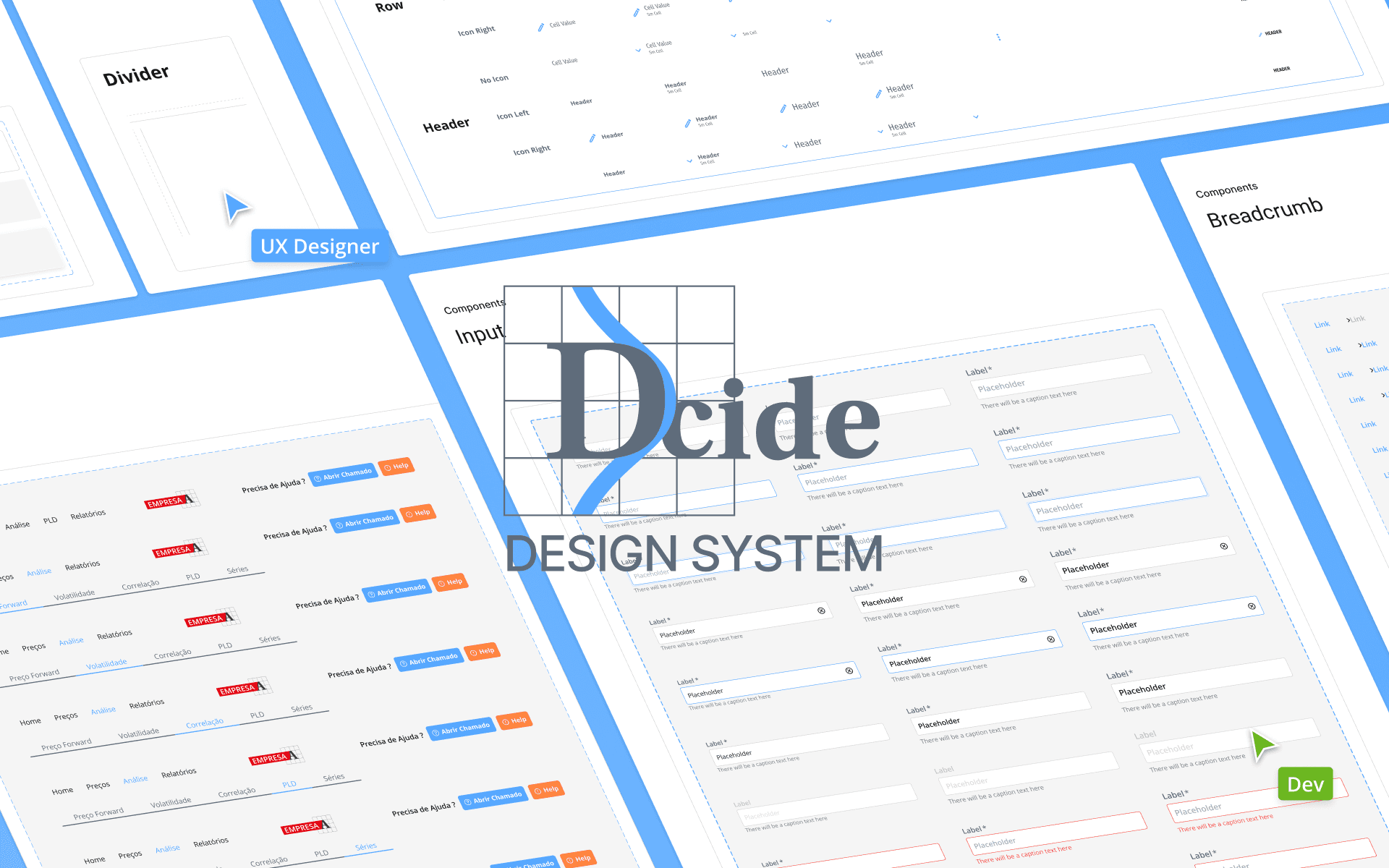
The Dcide Design System promotes uniformity, productivity, and extendability in projects through reusable components, established aesthetics, and comprehensive documentation. It seamlessly connects design and programming, optimizing processes and minimizing repetitive tasks.
The Dcide Design System promotes uniformity, productivity, and extendability in projects through reusable components, established aesthetics, and comprehensive documentation. It seamlessly connects design and programming, optimizing processes and minimizing repetitive tasks.
Dcide LTDA
52 hours
February 2024
Role: UX Lead
CONTEXT
CONTEXT
The Challenge of Consistency and Efficiency
The Challenge of Consistency and Efficiency
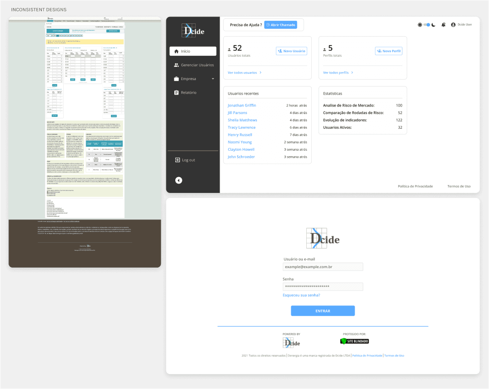
At Dcide Denergia, starting each project from scratch led to inconsistent designs, redundant work, and communication gaps. The solution? The Dcide Design System, a centralized library of reusable components, styles, and guidelines to streamline workflows and ensure uniformity.
At Dcide Denergia, starting each project from scratch led to inconsistent designs, redundant work, and communication gaps. The solution? The Dcide Design System, a centralized library of reusable components, styles, and guidelines to streamline workflows and ensure uniformity.
DISCOVERY
Uncovering the Root of Design Inefficiencies
Through workflow analysis and stakeholder discussions, I identified these key issues:
Through workflow analysis and stakeholder discussions, I identified these key issues:
Inconsistency: Design variations disrupted the platform's visual harmony.
Inconsistency: Design variations disrupted the platform's visual harmony.
Inconsistency: Design variations disrupted the platform's visual harmony.
Redundant Work: Similar components were repeatedly designed from scratch.
Redundant Work: Similar components were repeatedly designed from scratch.
Redundant Work: Similar components were repeatedly designed from scratch.
Dark Theme Adaptation: Existing designs didn't adequately support dark modes.
Dark Theme Adaptation: Existing designs didn't adequately support dark modes.
Dark Theme Adaptation: Existing designs didn't adequately support dark modes.
RESEARCH
RESEARCH
Platform Audit
Platform Audit
Overlapping designs with no reuse of existing components.
Inconsistent styles disrupting user experience.
No framework for supporting dark themes.
Overlapping designs with no reuse of existing components.
Inconsistent styles disrupting user experience.
No framework for supporting dark themes.
Overlapping designs with no reuse of existing components.
Inconsistent styles disrupting user experience.
No framework for supporting dark themes.
KEY TAKEAWAY
A unified system was necessary for saving time and ensuring visual harmony.
KEY TAKEAWAY
A unified system was necessary for saving time and ensuring visual harmony.
KEY TAKEAWAY
A unified system was necessary for saving time and ensuring visual harmony.
DESIGN PRINCIPLES
Through workflow analysis and stakeholder discussions, I identified these key issues:
Through workflow analysis and stakeholder discussions, I identified these key issues:
Scalability
Scalability
Scalability
Consistency
Consistency
Consistency
Efficiency
Efficiency
Efficiency
Accessibility
Accessibility
Accessibility
DEFINE & IDEATION
DEFINE & IDEATION
Laying the Groundwork for a Unified Design Language
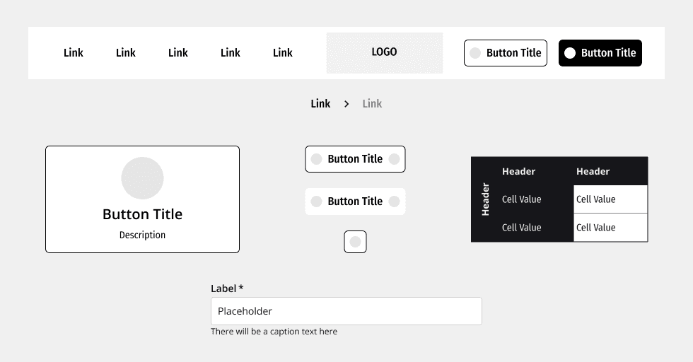
Centralized UI components using Atomic Design principles.
Centralized UI components using Atomic Design principles.
Collaborated with developers to include tokens and CSS snippets in Figma.
Collaborated with developers to include tokens and CSS snippets in Figma.
Prototype
Prototype
Bringing the Dcide Design System to Life
The system will grow and be used by many people. To make sure everything works well as it expands, I focused on using basic design ideas, creating components that fit together, and using simple options for different variations.
The system will grow and be used by many people. To make sure everything works well as it expands, I focused on using basic design ideas, creating components that fit together, and using simple options for different variations.
Components
Buttons: Multiple states (hover, active, disabled).
Buttons: Multiple states (hover, active, disabled).
Buttons: Multiple states (hover, active, disabled).
Tables: Adaptable layouts for data display.
Tables: Adaptable layouts for data display.
Tables: Adaptable layouts for data display.
Forms: Input fields with error and success states.
Forms: Input fields with error and success states.
Forms: Input fields with error and success states.
Cards: Dynamic containers for displaying content.
Cards: Dynamic containers for displaying content.
Cards: Dynamic containers for displaying content.
Headers & Footers: Navigation elements.
Headers & Footers: Navigation elements.
Headers & Footers: Navigation elements.
Icons: Simplified symbols for product types.
Icons: Simplified symbols for product types.
Icons: Simplified symbols for product types.
Styles
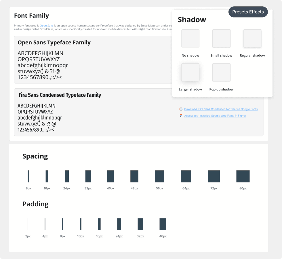
Spacing: Consistent padding and margins.
Spacing: Consistent padding and margins.
Spacing: Consistent padding and margins.
Typography: Clear font hierarchy.
Typography: Clear font hierarchy.
Typography: Clear font hierarchy.
Color Palette: Harmonious shades for light and dark themes.
Color Palette: Harmonious shades for light and dark themes.
Color Palette: Harmonious shades for light and dark themes.
Shadows: Subtle depth effects.
Shadows: Subtle depth effects.
Shadows: Subtle depth effects.
TESTING
TESTING
Validating the Design System with Stakeholders
To validate the system, I conducted internal usability testing with stakeholders and developers. The feedback indicated that the project has met the expected results without any necessary modifications.
To validate the system, I conducted internal usability testing with stakeholders and developers. The feedback indicated that the project has met the expected results without any necessary modifications.
PROJECT COMPLETION & HANDOFF
PROJECT COMPLETION & HANDOFF
Ensuring a Smooth Transition to Developmen
After completing the project, I conducted a 1-hour handoff call with the development team to introduce the system and address questions. Attendees included:
After completing the project, I conducted a 1-hour handoff call with the development team to introduce the system and address questions. Attendees included:

Elias Colares
Software Development Coordinator

Carlos Ruesta
Co-owner and IT Director

Vinicius Rocha
Full-stack Developer Senior
During the call, I presented the system, shared usage guidelines, and provided code snippets. The team quickly understood the system and began implementation, successfully deploying components to production.
During the call, I presented the system, shared usage guidelines, and provided code snippets. The team quickly understood the system and began implementation, successfully deploying components to production.
NEXT STEPS
NEXT STEPS
Expanding and Evolving the Dcide Design System
Expand the system to include more advanced components like modals and notifications.
Expand the system to include more advanced components like modals and notifications.
Expand the system to include more advanced components like modals and notifications.
Create a comprehensive onboarding guide for future team members.
Create a comprehensive onboarding guide for future team members.
Create a comprehensive onboarding guide for future team members.
Regularly update the system to incorporate new requirements and trends.
Regularly update the system to incorporate new requirements and trends.
Regularly update the system to incorporate new requirements and trends.
Try It Yourself!
Try It Yourself!
Explore the Dcide Design System and experience how it streamlines design and development processes. Reach out to Dcide LTDA for more information or a live demo!